Lincoln Production Design

Diane Haithman is an AwardsLine contributor. This article appeared in the Feb. 13 issue of AwardsLine.

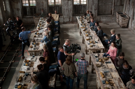
Veteran set decorator Jim Erickson, nominated with production designer Rick Carter for Steven Spielberg’s Lincoln, has a thing about authenticity. He once hunted down a collector of vintage candy wrappers to find just the right wrapper to reproduce for the movie Love Field (well, almost: He wanted a 1964 Butterfinger from Texas, but settled for a 1964 model found in Arkansas). Erickson took pleasure in creating authentic White House interiors because Lincoln was the first U.S. president whose life was well documented in photographs. Erickson talked to AwardsLine about the detailed work that went into re-creating Lincoln’s office.

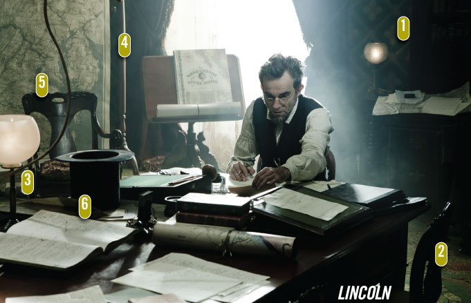
1) Lincoln was shot in Virginia using many real-life historic sites, but the Lincoln office was re-created on a set using photos as the guide. “We scaled off the pattern of the wallpaper and had it all designed and silk-screened. We worked up a pattern that was as close as we could actually get without having a real piece of it in front of us,” Erickson says. Erickson was able to find Carter & Company, a Richmond business with a staff of four that provides wallpaper for museums and historic homes and could do reproductions at a reasonable price. “Silkscreen is how they did wallpaper back then. It can create metallics and glazes a computer can’t do. The computer can give you images, but not the texture.”

2) During her White House tenure, Laura Bush remodeled what is known as the Lincoln Bedroom “but was really his office,” Erickson explains. The First Lady had hired an East Coast design firm to weave an authentic carpet. “We just contacted them, and they made us a carpet. (Mrs. Bush) had used her own color scheme, and it was very tasteful, but we wanted to get back to the original.”

3) Erickson is often displeased with the lighting in period films because it’s anachronistically bright. So when cinematographer Janusz Kaminski (also nominated) arrived for his first meeting, Erickson, who had acquired a vintage gas light fixture, set it up and lit it in a dark room. “And I said, ‘Janusz, this is how much light a gas light gave back then.’ I like to think I influenced him in some way. He did a brilliant job.” The gas line for the lamp on Lincoln’s meeting table goes up to attach to a chandelier outside the frame of the image.

4) Even if the audience can’t see the details, all maps and documents are meticulous copies of the originals. While the average viewer might not notice when it’s done right, Erickson says, when something is not accurate, it jumps out like a neon light. Plus, the actors need authenticity to get into character. “When I first started out in film, prop people were famous for putting in gag props. That is so disrespectful to the actor to do that, it just indicates that you don’t take their work seriously. Even the minutes for these meetings people had that were in their portfolios were the actual minutes, because these minutes were documented so well.”

5) Erickson says he cringed at the idea of buying period antique furniture, expecting it to be too expensive. He figured reproductions would have to suffice. Instead, “I did really well because there was an antique auction every week in Richmond—Wednesday, I think—and it was like a prop house for me. Also this Victorian furniture is very out of fashion right now, so it was ridiculously cheap. I’d go there every week and buy a truckload.”

6) Erickson can’t take credit for the iconic stovepipe hat—talk to the costume department. But, he says, “I think all of us who are nominated should wear them to the Oscars.”

Life Of Pi Production Design

Diane Haithman is an AwardsLine contributor. This article appeared in the Feb. 13 issue of AwardsLine.

It was, in the words of production designer David Gropman, “a very large endeavor for a very short moment.” For Ang Lee’s Life of Pi, designers created a faithful reproduction of the real-life Piscine Molitor in Paris in the 1950s. The set did not get much screen time, but Gropman says Lee insisted that the pool be fully rendered as an important key to the story. Pi was named after the swimming pool (full name Piscine Molitor Patel). Besides explaining Pi’s odd moniker, Gropman says Lee wanted to explain Pi’s ability to master the water and his alarming companion at sea, an adult Bengal tiger. Pi’s father survived polio as a young boy so he could not swim, but “he was happy to see his son be able to, not realizing it would one day save his life,” Gropman says.

1) The scene begins with a closeup of the Piscine Molitor sign. As a youth, Pi adopts the nickname to avoid having fellow students call him “Pissing” instead of Piscine.

2) At first, filmmakers considered renovating the real Piscine Molitor, once a world-famous attraction but now a piece of derelict architecture occasionally used for fashion shows and special events. But prohibitive costs led to creating a pool set to exact dimensions on the tarmac of an airport in Taiwan that the production crew had turned into studios and soundstages. A portion of the pool was dug 5 feet deep and filled with water so actors could actually take a dip.

3) On the right side of the frame, the design team constructed an actual replica of the three stories of dressing rooms that flank the real Piscine Molitor. On the left, the matching bank of dressing rooms is a CGI extension. On both sides, the people and their beach umbrellas are real.

4) While designers took pains to replicate the exact dimensions and design of the pool, dressing rooms, and decks, all bets were off when it came to the skyline, a fantasy Paris featuring landmarks including the Eiffel Tower and Notre Dame (neither are visible from the real Piscine Molitor). “We took tremendous liberties with that skyline,” the designer says with a laugh, adding that they wanted the look of a picture postcard.

5) Color plays a significant role in the film’s design. Blue, white, and orange dominate, both in this scene and later scenes of Pi and his tiger companion lost at sea. “I knew that blue—between the ocean, the pool, and the sky—was going to be a very strong color,” Gropman says. “The interior of a lifeboat is orange so it can be spotted from far away—not to mention having a Bengal tiger, who is a very orange fellow himself. The hard white you see in the Piscine Molitor is echoed in the outside of the lifeboat.” An aqua shade popular in the 1950s colors the beach umbrellas and turns up in the elegant swimwear along with coordinating pastel yellows, greens, and pinks.

6) What role did the 3D play for the designers? Gropman says Lee insisted that he and his supervising art director attend a master class in the technique. Lee did very little in the way of 3D tricks, that is, having objects suddenly pop out of the screen—rather, he asked Gropman to use the 3D perspective to create an illusion akin to the depth of a theater stage. “It’s a 3D approach, but borrowed from a much older tradition,” Gropman says. The pool structure is “very much a frame with four walls, the first one being the proscenium, where the balcony is.”

Les Miserables Production Design

Diane Haithman is an AwardsLine contributor. This article appeared in the Feb. 13 issue of AwardsLine.

The set for an empty street—easy, right? Not when you’re working on the movie version of the hit stage musical Les Misérables for director Tom Hooper (2010’s Academy Award winner for The King’s Speech). Production designer Eve Stewart says Hooper was such a stickler for authenticity in re-creating 1832 Paris that, for the first few days, “there was an awful lot of horse poo about—real horse poo.” To avoid a rebellion on the part of cast and crew, real horse droppings were quickly replaced with fakes. By phone from London, Stewart talked about this and other challenges in creating just the right look for Rue de la Chanvrerie as described in Victor Hugo’s classic novel.

1) Buildings in 1832 Paris, the year of the June Rebellion depicted in the film, “were still very medieval, not like the Paris you see now,” says Stewart, who was able to find historic newspaper pictures to use as guides. Tall buildings lined streets so narrow that people could throw furniture out upper windows and quickly create a barricade. These buildings, constructed at London’s Pinewood Studios, are 40 to 50 feet high. “It was actually cheaper to build them that height than to do it by computer,” Stewart says. More modern Parisian streets were made wider, says Stewart, so revolutionaries could no longer block passage “with a couple of armchairs.”

2) The buildings are not only tall, they lean and sag in all directions. “What was really difficult for me was to persuade the usual perfectionist carpenters and plasterers to make everything crooked,” Stewart explains. “It was really important to have all the buildings look like exhausted, tired, stricken members of the community.” Stewart used mostly salvage wood and old doors to help create the downtrodden look.

3) The cobblestone street is wet after a summer storm, the backdrop for the dying Éponine’s big song, “A Little Fall of Rain.” Because songs were performed live, the roofs of buildings were carpeted to mute the “raindrops” falling from water machines hanging from grids on the studio ceiling. In fact, Stewart says, many design details, including horses’ hooves, carriage wheels, and beads, had to be “made rubbery” or coated to avoid clops, clacks, and clinks during live musical performances.

4) This sign for an ophthalmologist’s shop has a literal meaning as well as a symbolic one. Circa 1832, “making spectacles was quite a big business in Paris, especially in the backstreets. It was described in Hugo’s novel, so I was keen to get it in,” Stewart says. The eye also plays into an attempt to introduce a subtle religious motif throughout the film: “Quite often you’ll see a little cross, the eye of the Lord, individual bits and pieces to show the greater spirit of the Lord.”

5) Other signs of the times: As described in Hugo’s novel, Parisian streets were teeming with businesses that promoted their wares by hanging posters and graphics and even painting directly on plaster walls. As in the case of the sagging buildings, Stewart wanted a naturalistic imperfection, so she hired an 80-year-old English sign writer, Graham Prentice, to do the lettering, rather than a scenic artist. “I was very keen to get slightly wonky sign-writing,” Stewart says. “He’d walk around in his old Parisian overalls. It was part of the joy of that set. It was a little community. Carpenters and painters would take pride in their own buildings: ‘Ours was better.’ ”

Anna Karenina Production Design

Diane Haithman is an AwardsLine contributor. This article appeared in the Feb. 13 issue of AwardsLine.

The Anna Karenina design team had to switch gears fast when director Joe Wright decided to set Anna’s oppressive high-society world inside a theater instead of shooting on location in Moscow and St. Petersburg. Money talked; location shooting would have blasted the film’s modest $31 million budget. Production designers had only 12 weeks to create interior and exterior “locations” that could exist within the confines of a theater set. In this stylized approach, the movie audience is aware of the theater, but the movie characters are not. The walls around Anna become literal, not figurative. “A Rubik’s Cube is often how we described this film: You’d twist it and then, suddenly, you’d twist it again, and it would just fall apart in your mind,” says production designer Sarah Greenwood. “You’re not just making pretty pictures here; you are telling a very big story.” Greenwood and set decorator Katie Spencer talk about putting together the puzzle of the living room set for the Moscow home of Oblonsky, Anna’s brother.

1) This scale model of the Oblonsky house stands inside the larger Oblonsky living room set, which in turn stands inside the larger theater set. Designers liken the layers of interiors (and meaning) to Russian nesting dolls. Keira Knightley’s Anna and the children look like giants trapped inside the ornate small-scale house. Although she is visiting her brother’s family in Moscow, Anna, from St. Petersburg, still appears caged the way she is in her own austere home and loveless marriage.

2) Greenwood and Spencer designed this colorful, richly textured interior to contrast Anna’s life in St. Petersburg with her brother’s life in Moscow. Greenwood says that during this period, Moscow borrowed from the exotic Eastern style of the Ottoman Empire and was “rejoicing in its Russian-ness,” whereas design was more spare and Western in St. Petersburg. The chaotic scatter of pillows, musical instruments, and children’s toys also highlights the difference between the earthy, boisterous Oblonsky home and the passionless lifestyle of the Karenina family.

3) This little theater-in-a-box is a child’s toy, but also represents a scale model of the larger theater set. Inside the small theater, the stage is set for The Nutcracker ballet (a detail audiences might never notice, but that became a fun project for art department assistant Martha Parker). Another insider’s treat: The little blocks on the ministage are a miniature version of the medium-sized alphabet blocks Levin uses to propose to Kitty in a later scene. Completing the trio: On this set, up high and to the right, are several alphabet blocks in a larger size.

4) The designers call this gold chair and footstool “transition pieces” from the living room set to the theater’s backstage area, represented by the empty picture frames and painted flats stacked behind and alongside the chair. Light streams into the theater through a window piled with snow. In the movie, this prop-shop area is the theater’s basement, but the actual set was built on the same level as the rest of the theater spaces. The chair is draped with a 100-year-old real leopard skin rented for the production (law would prevent the use of a new fur from an endangered species). In late 19th-century Moscow, Spencer observes, there was no such thing as too much opulence, or too much gold leaf.

5) The doll fits into the story, but also pays homage to director Joe Wright’s upbringing. The English director’s parents founded Little Angel Theater, a puppet theater in Islington. “The doll she’s holding is a puppet, and that little puppet was made by Joe Wright’s mother,” says Spencer. “Keira (as Anna) also uses the puppet when she talks about when she was first married and how she believed in love.”


The Hobbit: An Unexpected Journey Production Design

Diane Haithman is an AwardsLine contributor. This article appeared in the Feb. 13 issue of AwardsLine.

Production designer Dan Hennah—nominated for The Hobbit: An Unexpected Journey with set decorators Ra Vincent and Simon Bright—says that this set for hobbit Bilbo Baggins’ comfy parlor is one of few that did not require a CGI extension to accommodate both fantasy elements and the movie’s large band of characters, who tend to appear together in many scenes. And even the simplest of sets required finetuning to meet the demands of 3D. By phone from New Zealand, Hennah talked about this scene in which Bilbo (Martin Freeman) talks with Dwalin (Graham McTavish) as the dwarf slurps his way through Bilbo’s carefully hoarded food supply.

1) Bilbo’s parlor had to be built twice: Once in “hobbit scale” and once in a .76 “wizard scale” for Gandalf (Ian McKellen), so Gandalf would appear to be too tall for his surroundings, whereas for the hobbits it would be, as Goldilocks might have observed, “just right.” Hennah says the less dramatic difference in size between hobbits and dwarves was taken care of by casting: Most actors portraying dwarves are taller than Freeman.

2) Hobbits hate adventure, so Bilbo’s home is full of things that make him feel safe: A warm teapot, a full larder, his favorite books. “This is 60 years before The Lord of the Rings, when he was sort of an old guy who had accumulated a lot of stuff and was sort of untidy; this was more (for) a casual, homely bachelor,” Hennah says. For The Hobbit, Hennah’s team took advantage of the fact that New Zealand can boast more traditional craftspeople than a Renaissance Fair. “We had potters and glass blowers and pipe makers and book binders. New Zealand is a great place for alternative lifestyles, and that often translates into making something that you can sell,” he explains. The designers created their own fantasy era rooted in 17th-century England, but “once you make up the rules, you have to stick with them or you break the spell,” Hennah says.

3) That’s no rubber fish that Dwalin is noshing on: It’s the real deal, caught by one of the prop dressers who’d been out just that morning trying his luck in the local bay. “There were probably quite a few real fish, we were cooking them up” to use on set, Hennah says. Since dead fish are like houseguests (best if they don’t stay around too long), the crew kept plenty of ice on hand to keep them fresh.

4) Often books on sets have authentic bindings but blank pages. But Bilbo, Hennah says, “is sort of a learned chap” who loves to read, so his books can’t hide on the shelf. Plus he’s writing his own book, There and Back Again, using a quill pen. A calligrapher with quill expertise was called in to create the book pages. And the calligrapher worked overtime on a document used in another scene at Bilbo’s home, when he reads over the alarming contract he must sign before accompanying the dwarves on their dangerous quest to reclaim Lonely Mountain from the dragon.

5) The Hobbit was shot in 3D using a high-speed 48 frames per second (normal 2D speed is 24 fps). Some film critics thought the images created by the high-speed process were too sharp, making The Hobbit look more like a videogame than a feature film. Critical taste aside, Hennah says that extra clarity required more careful attention to items in the background or middle ground that would have appeared out of focus in regular 2D. Plus, 3D tends to desaturate colors, so everything had to be made in brighter colors than it appears.

Live Singing Challenged Les Mis Production Designers

Cari Lynn is an AwardsLine contributor. This article appeared in the Dec. 19 issue of AwardsLine.

It’s not likely that any of the 60 million theatergoers who saw the musical Les Misérables would have thought the stage production limiting, but they weren’t charged with taking the longest-running musical, set in 1800s France, and blowing it out to larger-than-life size. In what was described by Working Title producers as a “deceptively difficult” adaptation, director Tom Hooper assembled a team that included his longtime production designer Eve Stewart and veteran costume designer Paco Delgado to create a factually accurate world, sprinkled with the magic and fantasy of the beloved musical.

Fantine was dressed in pink to contrast the other factory workers in drab blue.

But what no one on the team knew going in was that all singing (and the film is 99% singing) would be shot live. This posed interesting challenges for determining locations, given sound considerations and the desire to use very little CGI. “But,” says Stewart, who was nominated for an Oscar for Hooper’s The King’s Speech, as well as 1999’s Topsy-Turvy, “new ideas are usually the best ones,” so the constraints didn’t narrow her scope as she scouted locations for 20 weeks. She eventually settled on a pristine mountain range in the south of France; the Portsmouth Historic Dockyard in England (where the HMS Victory is moored); an 18th-century rope factory in Kent (the timbers of which were so old that the crew was barred from lighting candles, so imitation flickering lights had to be used); the Old Royal Naval College in Greenwich; the River Avon in Bath; as well as a set crafted at Pinewood Studios in London. In each location, Stewart’s crew had to eliminate squeaky floorboards and door hinges, and horses had to be fitted with rubberized hooves. The only location Stewart didn’t have to adapt was Boughton House in Northamptonshire, which dates back to the 17th century and is dubbed the “English Versailles,” where the wedding scene was filmed.

As their inspiration, both Stewart and Delgado went “by the book”—as in, Victor Hugo’s 1862 tome, Les Misérables. “The novel is a recording of how people lived,” Delgado says, “what they ate, what kind of china they ate the food on, what kind of clothes they wore, what color the clothes were.” Both he and Stewart scoured flea markets and secondhand stores in France and Spain to purchase authentic clothing and furnishings.

While both studied the artwork of the period—Stewart cites the French artist Gustave Doré, while Delgado drew from Delcroix, Goya, and Ingres—the goal was far from creating a rose-colored world. “Tom has an amazing level of detail, and he wanted to show the levels of poverty and degradation in Paris at that time,” Delgado explains.

Cold water and an epic scale made shooting the shipyard scene difficult.

For the set, Stewart incorporated elements of a shipyard, bringing in nine tons of seaweed along with sacks of mackerel and hake that arrived straight from the wharf at 2 a.m. every day so that even the smell was authentic. “Everything with Tom is factual realism,” Stewart says, “and then, after that’s established, we can amplify and tweak upward.”

While the team tried to use as many authentic pieces and landmarks as possible, Stewart spent nearly a month re-creating the 40-foot-tall Elephant of the Bastille (Napoleon’s monument that no longer stands but was immortalized in Hugo’s book), carved from polystyrene.

Because a portion of the team came from a theater background, the set was initially outlined by building theatrical models, which is not commonly done on film. “You never know where Tom is going to film,” Stewart says, “so the buildings had to be (functional) with 360-degree stairs so the cast could run around.” Stewart also took care to craft the buildings with crooked, warped lines, evoking the age and an element of destruction.

Delgado—who had previously worked with Tom Hooper on a Captain Morgan TV ad, and was the costume designer for the Oscar-nominated Biutiful and Pedro Almodovar’s Bad Education and The Skin I Live In—had to “mar” his designs, creating 1,500 new costumes (out of a total of more than 2,000), which he then set about destroying with mud, grease, and blowtorches. “Paris was so poverty-stricken at that time,” Delgado explains, “and there was an amazing secondhand market where clothes were sold and resold and resold again until they were rags. It shocked me to learn that most poor people didn’t have any shoes.”

Delgado also wanted to tap into what he calls “the psychological atmosphere” of the time. “This is about the history of France, but also about the history of the Western world, and it was a big responsibility to create this world, but I also had to remember I was doing a musical with drama, and I needed to have color and fantasy.” One of the most poignant examples was the factory scene, where Delgado dressed Fantine (Anne Hathaway) in pink to contrast against all the other workers in drab blue. “In the book, Fantine is coquettish and beautiful and had some views of the petty-minded society, so I wanted this dress to belong to her lost past. It was all embroidered and had a level of craftsmanship that would make Fantine appear as an outsider among the rest of the women.”

Hooper and Delgado discussed a leitmotif, so Delgado evoked the colors of the French flag throughout, using blue costumes in the early factory scene, then red for the revolution, and then moving to white for the wedding and nunnery scenes. Delgado also altered the clothes to reflect the characters’ states, airbrushing shadows onto Fantine’s dress to enhance her wasted frame as she grew close to death, and then moving to the opposite extreme of padding Jean Valjean’s (Hugh Jackman) suits as his wealth and standing grew.

“This is our job,” says Delgado, “to try to interpret personalities and characters.”

Argo Production Design Required Authenticity Without Stereotypes

Diane Haithman is an AwardsLine contributor. This article appeared in the Dec. 19 issue of AwardsLine.

Remember the 1971 movie Shaft? Ben Affleck doesn’t want you to—at least, not while you are watching his 2012 movie Argo, set in the turbulent 1979-80 era of the Iranian revolution and the Iran hostage crisis.

In creating the look of Argo—the stranger-than-fiction true story of a covert mission to help six Americans flee Iran by posing as a Canadian movie crew— director/star Affleck was adamant that the design team create an authentic ’70s look without falling into disco-era extremes of fashion and style.

“Costume designer Jacqueline West shared with me the goal of not having the ’70s thing upstage the movie,” Affleck explains. “I didn’t want to have justfur coats and bell bottoms—Shaft—to communicate the period. It’s a period that could very easily be exploited for comedy, so have you to be really ginger about what you do. There’s a laugh waiting behind every haircut.”

The basement of the historic Los Angeles Times building in downtown L.A. became the CIA bullpen in Argo.

The design team, which included production designer Sharon Seymour, costume designer West, set decorator Jan Pascale, makeup department head Kate Biscoe, and a host of others, was not only faced with re-creating various United States locations but also locations in Tehran, which, for the most part, were shot in Istanbul, Turkey. “Sharon, Kate, and I were all very intent on making it look like it was shot then, not like it was shot now as a period piece,” West says. Because the hostage crisis was so well documented, there was plenty of resource material to draw from, she adds.

In one sense, the nature of the story made it easier to stay away from more comic aspects of ’70s fashion, such as extra-wide lapels and ties, wacky prints, neon colors, and platform shoes. Costume designer West points out that the main characters are Washington, D.C., government workers, more conservative and less interested in cutting-edge fashion than, say, denizens of Los Angeles or New York.

And as in any fashion era, West says, what you see on the street is not always up to date. “We didn’t want it spot-on to be a certain year, there’s a 10-year range,” West explains. “Especially back then; clothes weren’t as disposable in the 1970s.” And individual style often reflects character, not just period: The wardrobe for John Goodman’s character, Hollywood makeup artist John Chambers, is deliberately frozen in the 1960s.

West and her team did strive to reflect the less flashy aspects of period dress, including the color palette (in 1979, brown, burgundy, rust, and navy were the new black), as well as types of fabric, including lots of corduroy. Plus, she added, polyester was a bigger part of the picture then than now. And don’t forget plenty of hair, including mustaches and sideburns, for men: West jokes that there was no “manscaping” back then.

Although glasses are usually considered props and handled by the prop department, Affleck was such a stickler for detail he asked the costume department to oversee their acquisition. West commissioned frame designer Allyn Scura of Sebastopol, with whom she had worked on The Curious Case of Benjamin Button, to create exact replicas of the oversized spectacles worn by some of the real six houseguests.

At Los Angeles costume shops, West and her team were able to find many authentic period clothing items. For clothing that had to be made, they shopped for vintage fabrics because newer fabrics photograph differently. That was especially important because the movie uses real news footage from the period, so the audience’s eye is constantly comparing new filmmaking with period reality.

A particularly painstaking example of fabric obsession: Creating the many chadors worn by the women of Iran. “The women of Iran had been wearing Western clothes, because the shah had been encouraging it, but they all had to go back under the black chador, which became known as the ‘flag of the revolution,’” West says. “But they were running out of black fabric in Tehran, so women were dyeing tablecloths, bedspreads, and over-dyeing printed fabrics with black. (In Istanbul), we found a man who had access to some vintage black fabric that had been exported from Iran to Turkey. He was able to give it to us.”

The fact that Istanbul stood in for Tehran also proved a lucky break for the production designers. For example: A Los Angeles home in Hancock Park stood in for the Canadian ambassador’s home, but some of its features, including fixtures, were too updated for 1979. But fixtures from the right period were still being used in Turkey, Seymour says. “We shipped light switches and outlets from Istanbul to L.A.”

A number of Southern California locations were used: The embassy compound and interiors were shot at the Veteran’s Administration, and downtown’s Los Angeles Times offices stood in for CIA interiors. Ontario International Airport was transformed into Tehran Airport. The Warner Bros. lot in Burbank became the home of Studio Six Productions, the entity behind the phony movie—but the logo on the water tower was changed back to Burbank Studios, as it was then.

The locations weren’t so hard to find, but to furnish them, the production designers tapped a resource they would not have had in 1979: eBay. Because this is Hollywood, it wasn’t too hard to find vintage movie-set equipment, but try finding enough matched typewriters for a CIA office, a real Star Wars figure for a little boy’s bedroom, or 30-year-old TV sets that could be rewired and used to play vintage news footage. “It’s quite a long time ago, but not long enough ago that everything’s antique—it’s thrift-shop stuff almost,” West says. Affleck says a major debate ensued over whether his character would have a telephone answering machine in his apartment.

But why such attention to authenticity for an era many audience members have either forgotten or never knew? “I think all those details add up,” West says. “I think everything we do is part of the subtext of what the story is.”u