A Look At The VFX Nominees

Thomas J. McLean is an AwardsLine contributor. This article appeared in the Feb. 13 issue of AwardsLine.

This year’s nominees show how visual effects have spread from summer blockbusters to genres as diverse as superheroes, different flavors of fantasy, more traditional sci-fi territory, and even the art-house film. For each nominee, there’s a moment that makes it worthy of an Oscar nomination. Here, the visual-effects supervisors on the nominated films break down the key challenges and talk about the sequence that clinched the nomination.

Andy Serkis' mocap performance is recorded first, then Gollum's features and backgrounds are added later.
Andy Serkis’ mocap performance is recorded first, then his movements are used to inform Gollum’s movements.

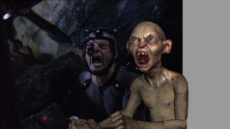
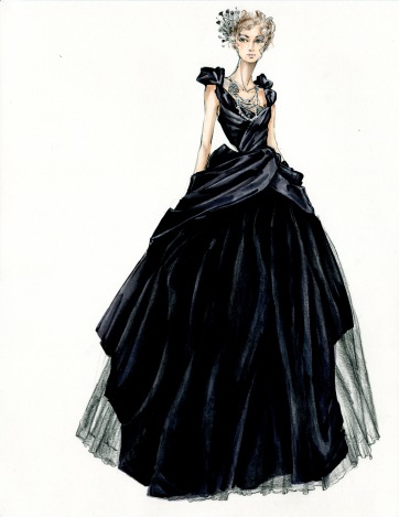
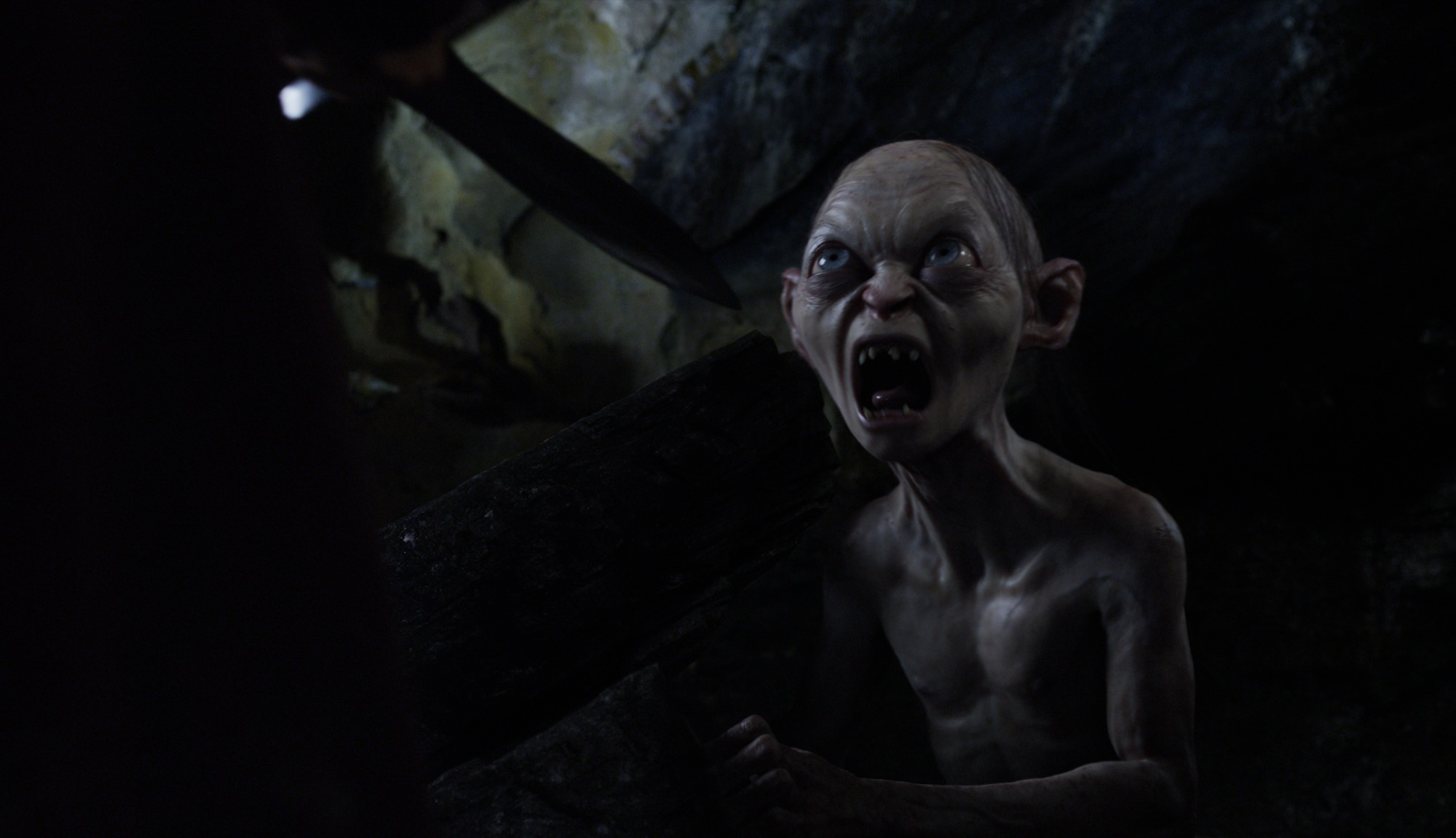
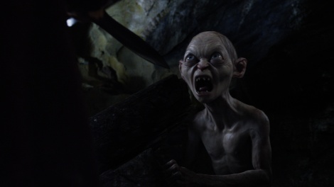
The Hobbit: An Unexpected Journey

The nominees: Joe Letteri, Eric Saindon, David Clayton, R. Christopher White

No. of visual-effects shots: 2,176

Tech breakthrough: The complexity and number of techniques used to create the digital creatures. “It’s a combination of lots of things to get a creature to that point,” says Letteri. “It’s muscles, it’s skin, it’s facial capture, it’s performance capture.” All those things had to come together to bring to convincing life six leading digital characters with dialogue.

Defining the aesthetic: “We were grounded in the Middle Earth we had established for The Lord of the Rings,” says Letteri. “For the landscapes and the environments, we wanted to extend that Tolkien-esque feeling, borrowing from what we had on the previous film, trying to keep the same look for Rivendell, for example, but kind of expanding it. Same thing with Gollum—we were trying to keep his same look, but bring him into a new dimension of what we could do 10 years on.”

Gollum's completed scene.
Gollum’s completed scene.

Biggest challenge: The quantity of digital characters. “You’ve got dialogue, you’ve got personalities, you’ve got unique looks,” says Letteri. “You’ve got to have everything working: You’ve got to have the fur working, the eyes, the skin, the muscles, the performances—not only the capture but the animation side.”

The clincher: The confrontation between Martin Freeman’s Bilbo and Gollum, played via motion capture by Andy Serkis. “We all had a bit of nervousness going into creating (Gollum) because we had done him 10 years ago, and we spent so much time in the last 10 years really trying to delve into what makes a performance resonate with an audience,” says Letteri. “You’ve got here a nine-minute dialogue scene with a real character and a digital character, and it’s watchable in a way that keeps you engaged the whole way through.”

The blue stuffed creature allowed the actor'to appear as though he were actually petting the tiger.
The blue stuffed creature allowed the actor’to appear as though he were actually petting the tiger.

Life of Pi

The nominees: Bill Westenhofer, Guillaume Rocheron, Erik-Jan De Boer, Donald R. Elliott

No. of visual-effects shots: 690

Tech breakthrough: Two of the major visual elements were done mostly with digital effects: The water and the tiger. “It was just pushing the bar for the realism of the tiger and the other animals involved, trying to blend water from a tank into CG water in stereo was a challenge,” says Westenhofer.

Defining the aesthetic: Westenhofer describes the look of the effects as “hyper-dreamlike reality.” “It’s a story being told by Pi, so there’s an element of his recollection and the human’s ability to exaggerate when they recollect,” he says. “That allows for a bit of stylization in the amount of color and detail.”

The completed sequence, in which the actor's real-life hands pet the digital tiger.
The completed sequence, in which the actor’s real-life hands pet the digital tiger.

Biggest challenge: It’s a toss-up between the water and the animals. “Fourteen percent of the animals were real and the rest were digital, and we often cut back to back between them, so it forced our hand to make the matches as perfect as possible,” says Westenhofer. “Everything from the moment they set sail to when he lands on the beach, it’s a boy on a boat in front of a blue screen.”

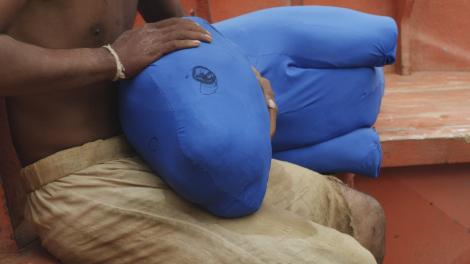
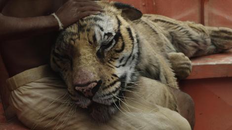
The clincher: A shot where Pi pulls the tiger’s head into his lap and pets it. “We shot him on the boat in a gimbal, and he pulls a blue sock into his lap and he pets the blue sock. And we replaced that with our digital tiger, fitting in the animation to what he did. In stereo, it had to be perfectly precise to line up with everything, and then we had to animate the hair to respond to his hand as it moves back and forth.”

Most of this scene was added digitally, after the actors finished their performances.

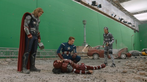
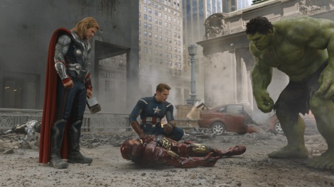
Marvel’s The Avengers

The nominees: Janek Sirrs, Jeff White, Guy Williams, Dan Sudick

No. of visual-effects shots: About 2,200

Tech breakthrough: The Hulk. “We leveraged on previous digital characters we had done, but really had to rebuild and improve the way our characters move, making it incredibly accurate in terms of the way the skeleton under his skin drives his muscles, which then drives his skin,” says White.

Defining the aesthetic: Invisible was

The completed scene.

the watchword from director Joss Whedon, a point defined by the final
battle in New York City that was shot almost entirely elsewhere. “Even though very little of the movie is shot
in New York City—some is Cleveland, where we did simpler set extensions, and then a significant portion was shot on a green-screen stage in New Mexico—those are things where we didn’t want the audience to even know there are visual effects,” says White.

Biggest challenge: The Hulk. “There’s a deep ravine to cross there, where it doesn’t look good for quite a long time, and it takes an incredible amount of artistry by the artists working on the shots to make it what it ultimately became,” says White.

The clincher: The climactic battle in New York. White says ILM spent about eight weeks shooting some 2,000 virtual background spheres—extremely high-resolution photographs—from streets and rooftops that were projected onto geography of the city as the basis for the digital city. To this was added the digital aliens and plates of the actors shot, as well as the details required to sell the scene as a full-on battle. “As we put our shots together of, say, Captain America talking to Black Widow, we really wanted to push it toward this feeling of being in the center of a battle. So in every shot we added additional smoke and dust and little embers going through the scene, just trying to really capture that feel of being in the middle of a disaster.”

prometheus
The VFX artists on Prometheus had to work on techniques to match the translucency of the alien prosthetics in the film.

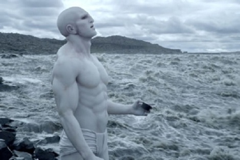
The nominees: Richard Stammers, Trevor Wood, Charley Henley, Martin Hill

No. of visual-effects shots: 1,284

Tech breakthrough: The specific look director Ridley Scott wanted for the alien creatures required redeveloping some commonly used tools. “We had to do a lot of work to really develop our subsurface scatter lighting technique to get that deep translucency that matched the prosthetics we were using live on set,” says Stammers.

Defining the aesthetic: The look of the alien landscape of LV-223 defined the look of the whole film and was something Scott was quite passionate about. “What we ended up with is this montage of two landscapes that he really liked. And then beyond that, we added additional mountains and sky that was very full of fast-moving clouds, and so you get a sense of constantly fast-moving layers of clouds and bad weather, (then) we could paint the landscape with fast-moving patches of sunlight.”

Biggest challenge: Stammers says the production only had three days to shoot all the references needed at Wadi Rum, Jordan, requiring an incredibly detailed plan. “We planned it out based on our Google Earth map of the location to the point where, for every take that we needed to shoot, we had a helicopter plan of altitude and GPS start and end point, so that we could go to each of the specific points and film the elements we needed in order to map out the terrain and texture it.”

The clincher: Everything came together in the shot of the Prometheus landing on LV-223. “We spent somewhere in the region of 300 or 400 days just on the texture work alone, just to get the level of detail we needed to sell the scale of it,” says Stammers. “All the elements come together in that one shot that we see throughout the rest of the film as well.”

snow white and the huntsman
Macrophotography played a key role in Snow White and the Huntsman.

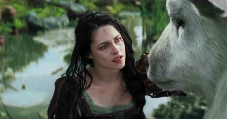
The nominees: Cedric Nicolas-Troyan, Philip Brennan, Neil Corbould, Michael Dawson

No. of visual-effects shots: About 1,400

Tech breakthrough: The extensive use of macrophotography in CG visual effects. “It’s very tricky to do macrophotography in a full CG shot, especially when you look at an animal or something close up like that, close up on the eye,” says Nicolas-Troyan. “That’s something that people don’t really realize when they see the movie, but if you pay attention you see there’s a lot of macro shots.”

Defining the aesthetic: Director Rupert Sanders set a distinct tone that required all the visual effects to be based in reality but juxtaposed with unusual situations or actions. “Everything is based on things that exist in the world,” says Nicolas-Troyan. “They might not be in the same place in the world, so we put them all together in this one spot, but they all do exist.”

Biggest challenge: Finding a way to make eight actors appear as dwarves on schedule and on budget. “We were always going to pick the right technique and the most efficient technique for the shot,” says Brennan. “That goes all the way from old-school in-camera tricks to using risers to vary the heights of people, working with prosthetics and costumes to make people appear a little bit different, all the way up to very complex effects like head and face replacements.”

The clincher: The pursuit through the Enchanted Forest, which encompassed all the techniques used in the movie. “Something like 70 percent or 80 percent of the animals that we created for the movie are in that scene, and they are everywhere,” says Nicolas-Troyan. “There’s birds, plants, and then within those scenes you have the dwarves, so we had to use pretty much all our techniques for the dwarves.”

Nominated Designers On Their Costuming Challenges

Cari Lynn is an AwardsLine contributor. This article appeared in the Feb. 6 issue of AwardsLine.

There were 2,000 costumes created for Snow White and the Huntsman.

Colleen Atwood | Snow White and the Huntsman

No stranger to the Oscar race with three wins (for Alice in Wonderland, Memoirs of a Geisha, and Chicago), plus another seven nominations, Atwood didn’t originally plan on a career in costume design. She’d gone to art school to study painting, but when she became pregnant in high school, her path diverged to retail fashion so she could earn a living. It wasn’t until her daughter was in high school that Atwood moved to New York and took a film class, where she found herself the go-to person for sets and costumes for her fellow students. Her first break was in 1980, working on sets and props for Ragtime.

Why it’s Oscar-worthy: “Any time you’re able to design a whole new world it sets it apart,” she says. “Personally, my work on Snow White and the Huntsman is some of the most interesting I’ve ever done because I got to use new and innovative materials and applications and shapes. To be nominated by your peers is fabulous and exciting because these are the people who really scrutinize your work, whereas everyone else can have an emotional experience to the costumes, but that’s pretty tied into the movie.”

The showstopper: “I was asked to do a presell image, so I designed a feathered, raven cloak for Queen Ravenna (Charlize Theron). All the feathers were hand-trimmed, and I worked with an amazing milliner in London so that, like a real bird, all the feathers go in different directions and catch the light in an amazing way.”

Biggest challenge: “The fact that we manufactured 2,000 costumes. We had two armies designed from the ground up, three courts, peasants, scary creatures, and dwarves, where everything had to be scaled down to size but still be realistic. Also, Snow White had to wear the same costume throughout much of the movie, and you couldn’t get tired of looking at it, plus it had to go through variations. When I found out she was running through the woods, I thought, We’re going to get sick of seeing the same dress full of mud. We decided to put in the story that the huntsman trims the dress, and I put Snow White in leggings underneath. After the dress is trimmed, I love what happened—it’s a look young people could associate with, and on practical level Kristen Stewart does a lot of her own stunt work so the leggings protected her from the branches and cold and elements of the forest.”

How would you dress the Oscar statuette?: “The raven cape would look great with the gold body. And a crown. We used an awesome Gothic crown in the movie.”

Much of Mirror Mirror's wardrobe was written into the script, according to director Tarsem Singh.
Much of Mirror Mirror‘s wardrobe was written into the script, according to director Tarsem Singh.

Eiko Ishioka | Mirror Mirror

With a previous Oscar for Bram Stoker’s Dracula in 1992, a Grammy for the 1986 Miles Davis album cover Tutu, and a Tony nomination in 1988 for M. Butterfly, acclaimed Tokyo-born designer Eiko Ishioka passed away of pancreatic cancer prior to learning of her Oscar nomination for Mirror Mirror. Hailed by The New York Times as one of the foremost art directors in the world, Ishioka also has work that is featured in the permanent collection of New York’s Museum of Modern Art. We spoke with Mirror Mirror director Tarsem Singh on the legacy of a pivotal designer, with whom he collaborated on all of his films.

Why it’s Oscar-worthy: “Eiko was a hell of an inspiration for us,” Singh explains. “Her verve flows out from her. Her DNA is completely in this film. You never had to say, ‘Think outside the box’ to Eiko. She belonged to a different planet. Usually people pull references from other films or research, (but) she never did that. She’d pull a photograph of an animal and say, ‘When the lizard is agitated, this is what it does with its neck.’ Her inspiration comes more from the natural history museum than any fashion magazine.”

The showstopper: “The wardrobe was written into the script—Eiko took my belief so viscerally. So if I say, ‘Let’s have a costume ball and make the queen stand out,’ she puts everyone in white on white and makes it an animal theme. Then there’s the Battleship game played with people’s hats. She does things I don’t think about until I see it, and I realize that every idea I talked about was incorporated. Then there are the dwarves. I wanted them to do fighting and didn’t want it to look CGI, but because this movie is also for children, the fighting couldn’t be aggressive. One of my biggest problems was solved by Eiko in a single conversation when she thought of doing accordion legs. We also discussed how the dwarves’ individual personalities had to come out through the clothes, but at the same time, they still needed to look like one group. So Eiko decided everyone’s personality should be in their hat.”

Biggest challenge: “Eiko was never fond of the practical. She would make what filmed the best, but it may not have moved. The toughest was for the dwarves—we didn’t want to have a Disney look, but they still had to look like a gang. Then, the Queen’s (Julia Roberts) wedding dress took a team to move it, and we made several dresses to shoot from different angles. If Julia was sitting, there was one dress, another for when she was in the coach. I was trying to make things easy for Eiko because she was undergoing cancer therapy, but she doesn’t know easy. She’d make seven choices of everything; I’d pick one, and then she’d present seven more variations on that. We spoiled her and said, ‘Let her have her time.’ It does make it more difficult for actors though—take a step in this (version of the costume), sit in that one, say your line in that one.”

How would Eiko dress the Oscar statuette?: “It’s so hard to try to guess. You would never tell Eiko what to make! I imagine she would have done something that would’ve been very hard to lift. If someone complained it was too heavy, she would have said, ‘You go put on weight then!’ ”

Many of the costumes in Les Mis had to be broken down by hand with mud, grease, and blowtorches.

Paco Delgado | Les Misérables

Trained in set and costume design at the Institut del Teatre of Barcelona, Delgado has worked extensively with Spain’s most famous director, Pedro Almodóvar, on 2004’s Bad Education and 2011’s The Skin I Live In, as well as on Mexican director Alejandro González Iñárritu’s Oscar-nominated Biutiful in 2010. In a twist of fate, Delgado met director Tom Hooper (Les Misérables, The King’s Speech) when they worked together on a Captain Morgan TV ad, and now Delgado has earned his first Oscar nomination for the epic film adaptation of the longest-running musical in history.

Why it’s Oscar-worthy: “This is about the history of France, but also about the history of the Western world,” Delgado says, “and it was a big responsibility to create this world, but I also had to remember I was doing a musical with drama, and I needed to have color and fantasy.”

Biggest Challenge: “We created 1,500 new costumes, out of a total of over 2,000 costumes, and many of them we had to break down with mud, grease, sand, brushes, and blowtorches because we wanted to reflect how poverty-stricken Paris was at that time. (In my research) I learned they used an amazing secondhand market where clothes were sold and resold and resold again until they were rags. Also, Tom and I had discussed a leitmotif, so I evoked the colors of the French flag throughout, using blue costumes in the early factory scene, then red for the revolution, and then moving to white for the wedding and nunnery scenes. Also, there’s always a fight with the budget and with time.”

The showstopper: “I wanted to try to interpret personalities and characters through the costumes. In Victor Hugo’s book, Fantine is coquettish and beautiful and had some views of the petty-minded society, so I wanted her factory dress to belong to her lost past. [Ed. note: Fantine’s dress was pink in the scene, in stark contrast to the other factory workers in drab blue.] It was all hand-embroidered and had a level of craftsmanship that would make Fantine appear as an outsider among the rest of the women.”

How would you dress the Oscar statuette?: “He already looks so sexy naked. After all, every woman and even every man wants to bring him home. I would do a version of the sexiest dress ever, like the transparent glittering dress that Marilyn Monroe wore at President John F. Kennedy’s birthday at Madison Square Garden. It’s very appropriate for Oscar who only appears in his birthday suit—and I’m very proud I have been invited to his 85th birthday!”

The design for this dress was based on two separate dresses found during research.

Joanna Johnston | Lincoln

Johnson’s biography reads like a “best films” list spanning more than three decades. She cut her teeth as an assistant costume designer on Roman Polanski’s Tess in 1979 and went on to be the go-to designer for Robert Zemeckis (Forrest Gump, Who Framed Roger Rabbit?, Cast Away), M. Night Shyamalan (The Sixth Sense, Unbreakable), and Steven Spielberg (the Indiana Jones franchise, The Color Purple, Saving Private Ryan, War Horse). Somehow, though, Oscar evaded this British designer until now, with her much-lauded Lincoln, Johnston’s eighth Spielberg-directed film.

Why it’s Oscar-worthy: “I suppose it hits a button with the balance of the piece as a whole,” she says. “I think the work is quite quiet—most of my work is not showcase-y but relatively character-driven. The academics and the historians seem to be happy at the accuracy, and my thought is (voters) normally go for the very expansive and forward-projecting and not necessarily the things that are understated, so all I can say is I’m really, really pleased.”

The showstopper: “I don’t have a piece designed to be a showstopper—it’s not that kind of film; Lincoln himself is the most iconic, but if there’s one that pushes above in my mind, it’s Mary Todd’s cream dress when she goes to the theater. You see it as a whole dress, and I based it off of two dresses of hers that I saw in portraits and fused together. I embellished the neckline and the sleeves because I wanted to do something to help Sally Field’s physicality get more into Mary Todd’s physicality, so I depicted Mary Todd’s affectation of fussiness in her dress.”

Biggest challenge: “The whole film! Each film is unique, but this is a completely different film, a different creature than anything else—it had its own character and rhythm and roots and had a very long gestation period of eight years. I was involved to a tiny degree over a six-year period.”

How would you dress the Oscar statuette?: “I would keep him as he is. I don’t think he could be improved—although I think he’d look kind of cool in armor, beautiful armor with a lot of tooling.”

The costume designer incorporated 19th- and 20th-century elements to create the look for Anna.

Jacqueline Durran | Anna Karenina

A favorite collaborator of director Joe Wright’s, British designer Jacqueline Durran has garnered two other noms for Wright’s Atonement and Pride & Prejudice. Not bad for a designer who says she couldn’t understand why Wright had even asked to interview her for his first feature, Pride & Prejudice, given that Durran hadn’t previously done pre-20th-century designs.

Why it’s Oscar-worthy: “I think it’s the whole thing, how all the elements mesh together and become such a complete vision,” Durran says. “The way they move through the theater and the colors and the costumes, we all benefit from each other’s work. Joe had such a strong vision; he always had the idea that the film would be stylized, and in our first meeting he said he wanted to concentrate on silhouettes. We got to talking about how 1950s couture is about silhouettes, and how dramatic and beautiful it was, and from there it seemed we could combine 1870s dress with elements from the ’50s.”

Biggest challenge: “One part is that Joe is a challenging director because he pushes you to do more, to rethink things or to come up with different ideas. The other part is the idea of Anna Karenina, you hear it and you say, ‘Oh, god. It’s such a big idea.’ She’s got to look beautiful, the world has to be beautiful, you have to capture this luxurious beauty, and for that I had to raise my game. You feel you have something to live up to.”

The showstopper: “My personal favorite is the cream dress in the tea room in Moscow—I thought it really suited Keira Knightley, and also it was the most fully fledged version of the 1950s/1870s combo, with traditional skirt and then a pillbox hat. There’s no point in trying to make a stylized statement if it doesn’t end up looking like anything, and this came together. However, I do think the overall show-stopper has to be the ball because of all the elements there—26 dancers, in what I call ‘sour pastels’, surround Anna Karenina, all in black, and Vronsky (Aaron Taylor-Johnson), all in white.”

How would you dress Oscar: “In diamonds and furs.”